
Turning Your Storage Into a Statement Piece Is the Latest Design Trend—Here’s How to Do It
Your organization routine just got a lot more colorful.

Christopher Stark
Whether you’re blessed with built-ins or put all your stuff on a store-bought bookshelf, storage is an important—okay, necessary—part of every home. But, if we’re being totally honest, most organizational systems aren’t winning your space style points anytime soon. While you can dress up shelves and cabinets with cute knobs or shelfie layouts, these areas still tend to be utilitarian, serious, and a little… well, blah.
Recently, however, designers have been leaning into statement storage by painting built-ins and bookshelves in an eye-catching, contrasting hue. Sure, painting a kitchen or bathroom cabinet is nothing new, but when done somewhere unexpected like a living room, dining room, or bedroom? It feels fresh and fun.
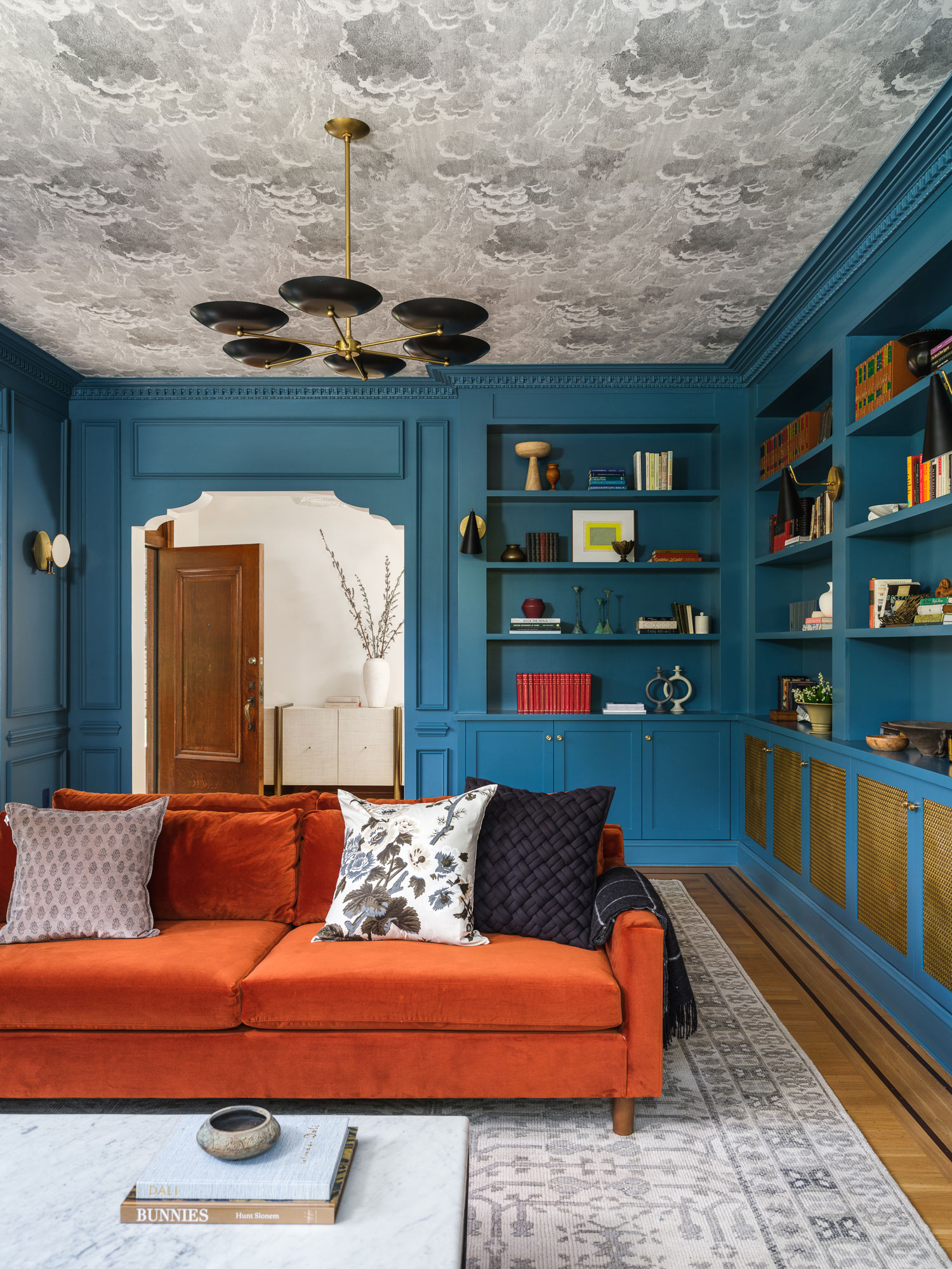
Design by Banner Day Interiors; Photo by Christopher Stark
“[There’s a] realization that something as practical as closed storage can also be a feature and bring interest into a space,” explains Clara Jung, principal of Banner Day Interiors in Berkeley, California. “Clients are seeing the value in these pieces, especially if they are custom, and choosing to engage thoughtfully with the design.”
More Videos From Sunset
In a time when people are steering away from sterile minimalism—and closer to bolder fads like dopamine decor and primary hues—statement storage seems right at home with the industry’s current penchant for pigments. But while this painted feature is poised to pop, it’s still important to practice some sense of restraint. Rather, Jung says it’s important that your statement shade still fits seamlessly into the rest of the room. “It, hopefully, shouldn’t scream, ‘clever storage here,’” Jung explains. “Instead, it should read seamlessly as part of the design with some decorative and architectural elements.”
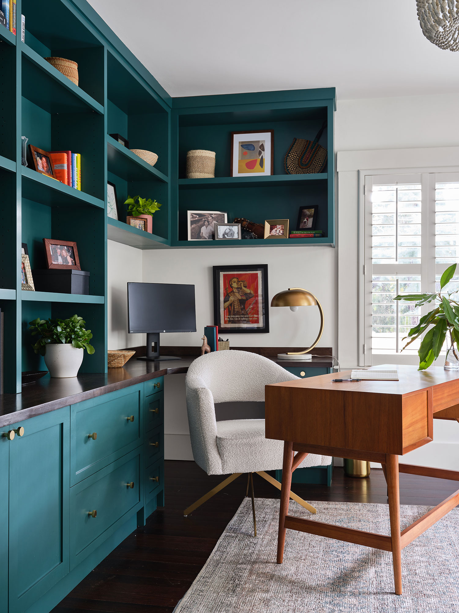
Design by Julie Beuerlein; Photo by Jessica Burke Photography
Statement storage might be having a moment, but with so many colors to choose, where do you begin? Designers are saving you a few swatches by sharing their top picks. For Julie Beuerlein, an interior designer located in Southern California, it’s important to take the whole room into consideration—and let the rest of the space inform your paint shade.
“Millwork offers a great opportunity to add interest and flair to a space,” she explains. “For a more maximalist or historical space, [painting your built-ins] is the perfect opportunity to pull a color from the wall covering or a complementary color.” Selecting an accent shade in a colorful repeat can create cohesion and bring out all the best details in your home.
Or, if your space is more like a blank canvas, many designers say a darker blue will add some high-design drama. While Beuerlein calls Benjamin Moore’s Dragonfly “a deep and dramatic teal sure to turn heads,” San Diego designer Christina Kelley is partial to the Farrow & Ball’s Railings shade.
“It can almost be a soft black with blue undertones but it’s truly more blue than black. If you want to add an accent color that reads timeless while anchoring your bookshelf or cabinet, this is your color.”
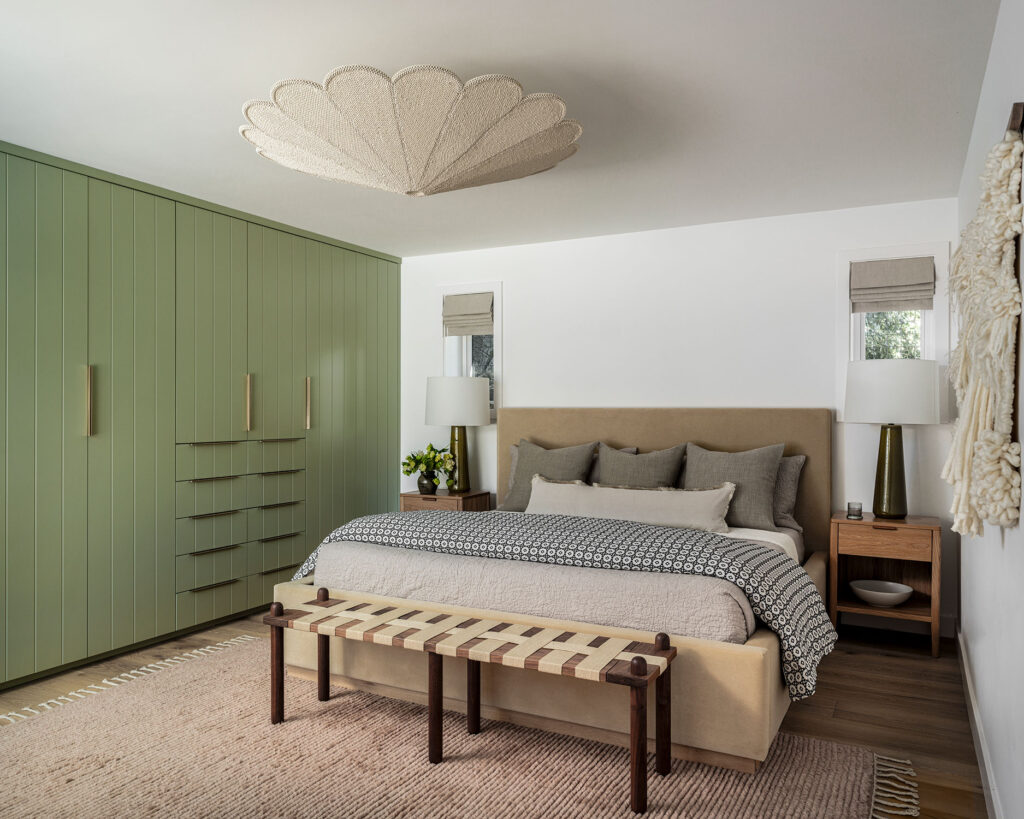
Design by Banner Day Interiors; Photo by Christopher Stark
Dark blue can turn your storage situation into a stylish spectacle, but if you’re looking for something slightly more subtle, let Mother Nature be your guide. Jung once brightened up a serene bedroom by painting its wall-to-wall closet Farrow & Ball’s Vert De Terre.
But whether you choose something chill or go for the bold—for example, Jung once painted a room’s walls and built-ins Benjamin Moore’s Georgian Bay for a perfect pop—the designer has one piece of advice. “Don’t be shy about the color,” she says. Honestly, she has a point. At the end of the day, beauty lies in the eye of the beholder, and shouldn’t your statement storage do the exact same?
We only recommend things we love. If you buy something through our site, we might earn a commission.
