
The Stunning Paint Color That Was Impossible to Find—Until Now
Sunset went on the hunt for a gorgeous but discontinued hue.

Photo courtesy of Annie Meisel
Before I worked at Sunset, I saved an Instagram post of an outdoor fireplace that completely flipped my lid. It was done in a gorgeous paint color that I can only describe as a sort of brownish, dark gray with purple undertones, which were teased out by potted lavender and muted textiles. The paint color was impossible to accurately put into words, held a sense of mystery, and was completely obsession-worthy.
Once I started my role as garden editor, I quickly realized the same fireplace I saw is featured in our gorgeous garage-turned-garden-room story, so I called up Meghan Rostovsky of Providence Design Group, an interior design collective in Los Angeles. I was prepared to beg her to tell me where I could buy this paint. Little did I know that I’d stumbled upon a color that had been lost to time.
“That brown is a famous color for us,” Rostovsky says, explaining that she used to work for famed interior designer Suzanne Rheinstein, who loves the Benjamin Moore shade. It turns out the paint was traditionally used on ironwork gates, fences, and banisters, but Rheinstein had the brilliant idea to use it, well, anywhere and everywhere.
More Videos From Sunset
So what is this famous paint? “It used to be called Bronzetone 60,” Rostovsky told me. “But if you look it up online, it will come up as this bright orange because [the original color] doesn’t exist anymore.”
Wait, my dream shade is discontinued? Rostovsky told me that yes, it is. I was crestfallen. Then I vowed to figure out how to get it anyway.

Photo Courtesy Annie Meisel
Before I say where you can get the paint—and I promise I will—let’s talk about why this particular color is worth all the fuss. “When you look at browns, they can go in a purple direction,” Rostovsky says, “yet this one is very neutral. It has a way of making every other color look good, and it’s a very grounding color. It’s strong, but in a quiet way.”
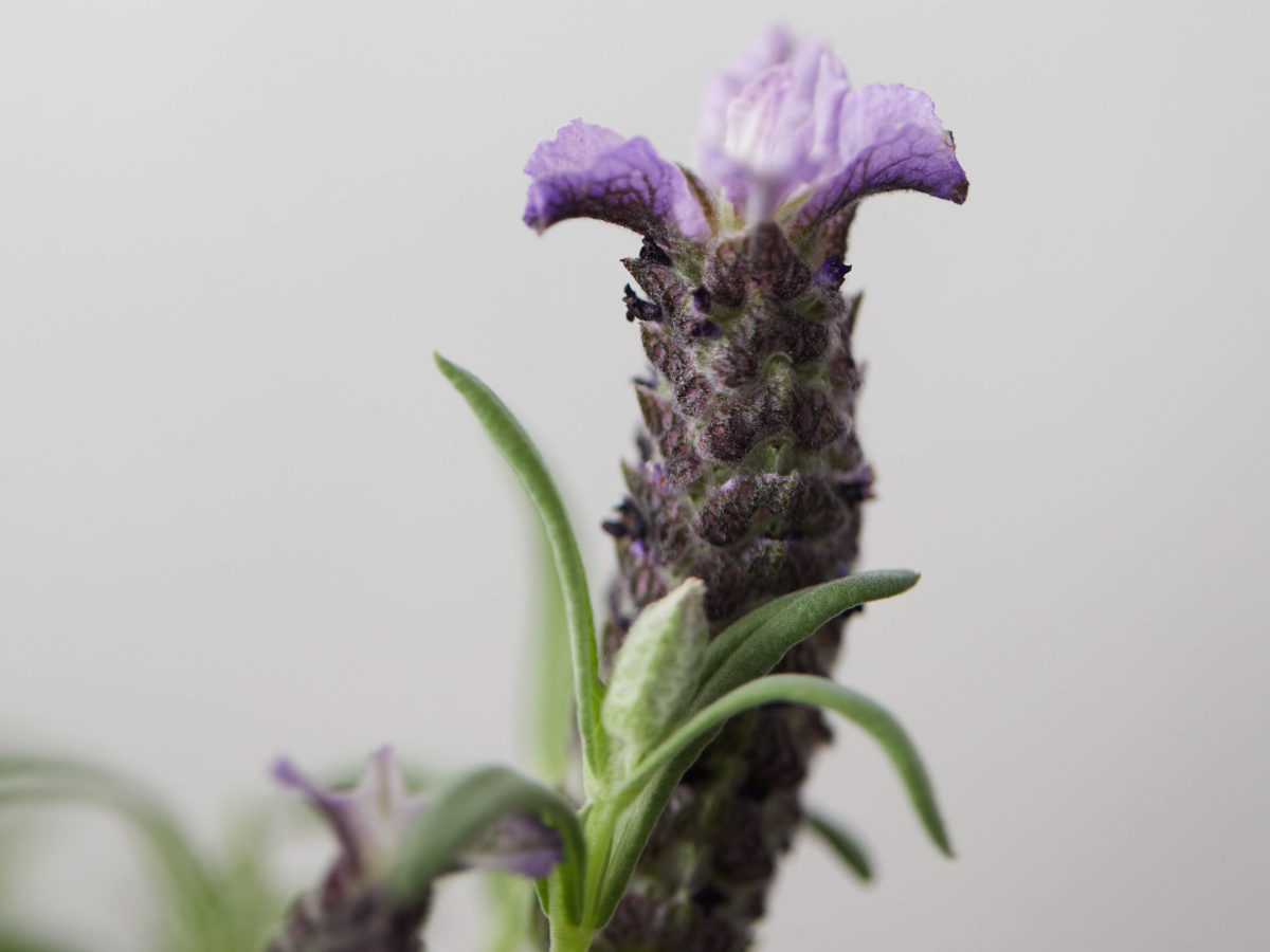
This shade pairs beautifully with light purple hues, which she chose for the textiles in her outdoor seating area, once again with a refreshingly neutral result. “Lavender works with greens; it works with the branches of the trees,” says Rostovsky. “It’s not a bold, pop color that you see in a lot of outdoor textiles. It’s a soft color that’s found in nature. Purple feels like such a bold choice, but when it’s lavender it’s soft and atmospheric and it just kind of fades away.”
Courtesy of Terrain
Now for how to get the discontinued paint color: Sunset found a Benjamin Moore dealer in Los Angeles where you can get a custom mix of what was once called “Bronzetone 60.” Sam Villarroel, the manager at Jill’s Paint in Atwater, has the formula and can mix it for Sunset readers in any finish, including interiors, exteriors and—for the fireplace of my dreams—masonry. Just tell him we sent you.
Keep in mind that color always looks different in photos than it does in person, so purchase a sample first. If you love it, you’ll end up with a shade that feels a little chocolate brown, a little dark gray, a little bit purple, and very special, indeed.
