
Are Moody Shades the ‘It’ Palette for 2025? Designers Weigh In
Turns out, the dark side has its perks.

Brad Knipstein
How can you measure a year in interior design? While some might argue it’s remembered by a series of buzzy (though fleeting fads), a great color palette can tell a lot about what’s in and out over the course of 12 months. After years favoring light and airy tones, the industry is making a seismic shift to the dark side. Not only did Pantone dub Mocha Mousse its Color of the Year for 2025, but many designers have used moodier shades in their home. Deep olive? Rich charcoal? Midnight navy? You name it, we’ve seen it splashed all over some of the most beautiful rooms. And, trust us, these “it” colors won’t lose their steam in the new year.
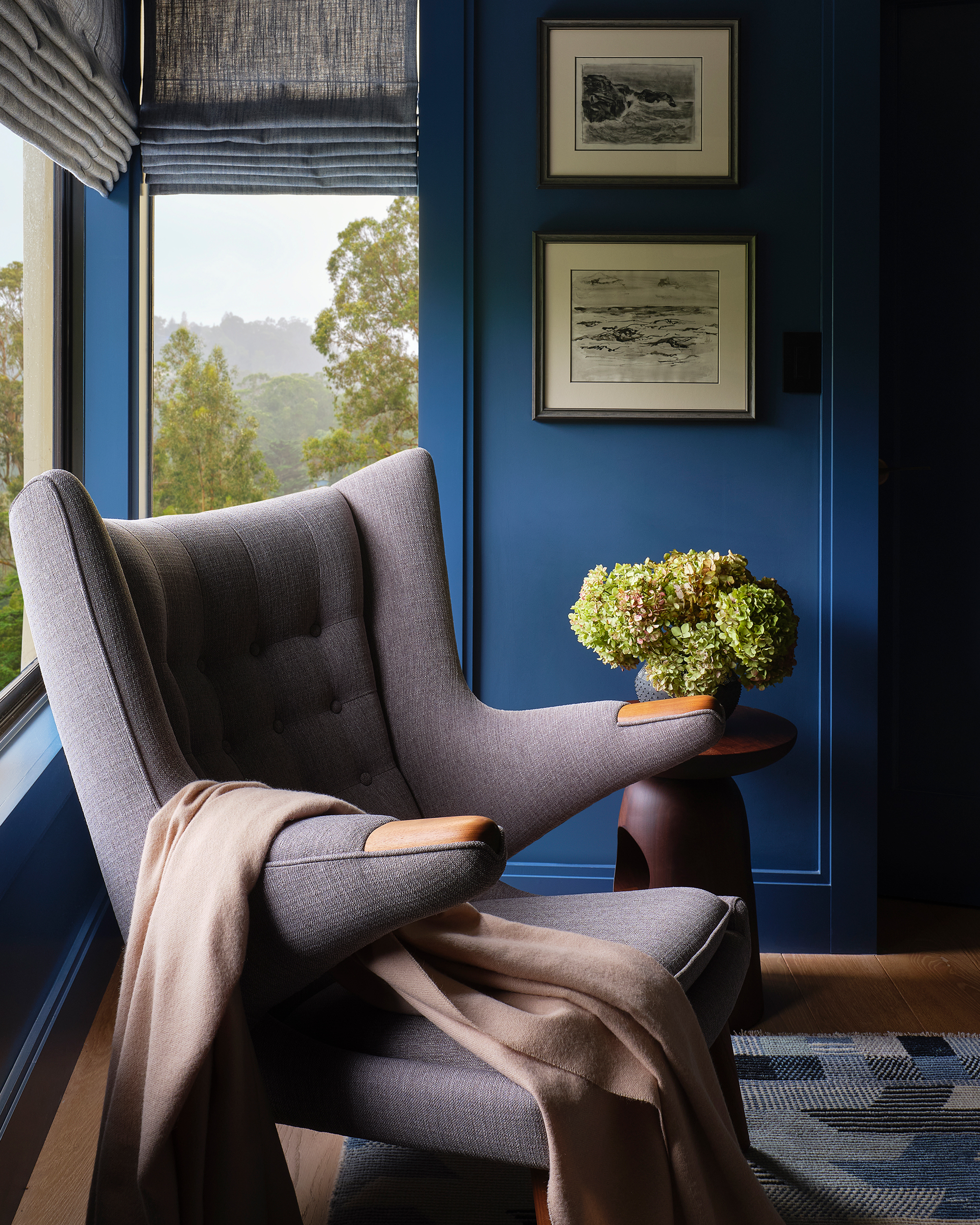
Design by Alicia Cheung/Studio Heimat; Photo by Brad Knipstein
Darker colors can often get a bad rap for appearing dreary and… well, an instant bummer, but industry insiders would argue the exact opposite. When used appropriately, a moodier palette can feel cozy and inviting. “Perhaps it takes us all the way back, like to the womb,” explains Alicia Cheung, an interior designer in San Francisco. “It’s embracing the darkness or lack of light, instead of feeling like it’s missing something.”
Denver designer Nadia Watts notes that, unlike the “Apple Store white-wall interiors” of yesteryear, dimmer hues can provide a sense of comfort and peace. “Dark colors, especially when color-drenched by painting trim and or ceilings the same color, ground a room,” she says. “They make a space feel cozy and enveloping, which creates that sense of peace we are all looking for.”
Design by Denise Morrison; Photo by Lance Gerber
More Videos From Sunset
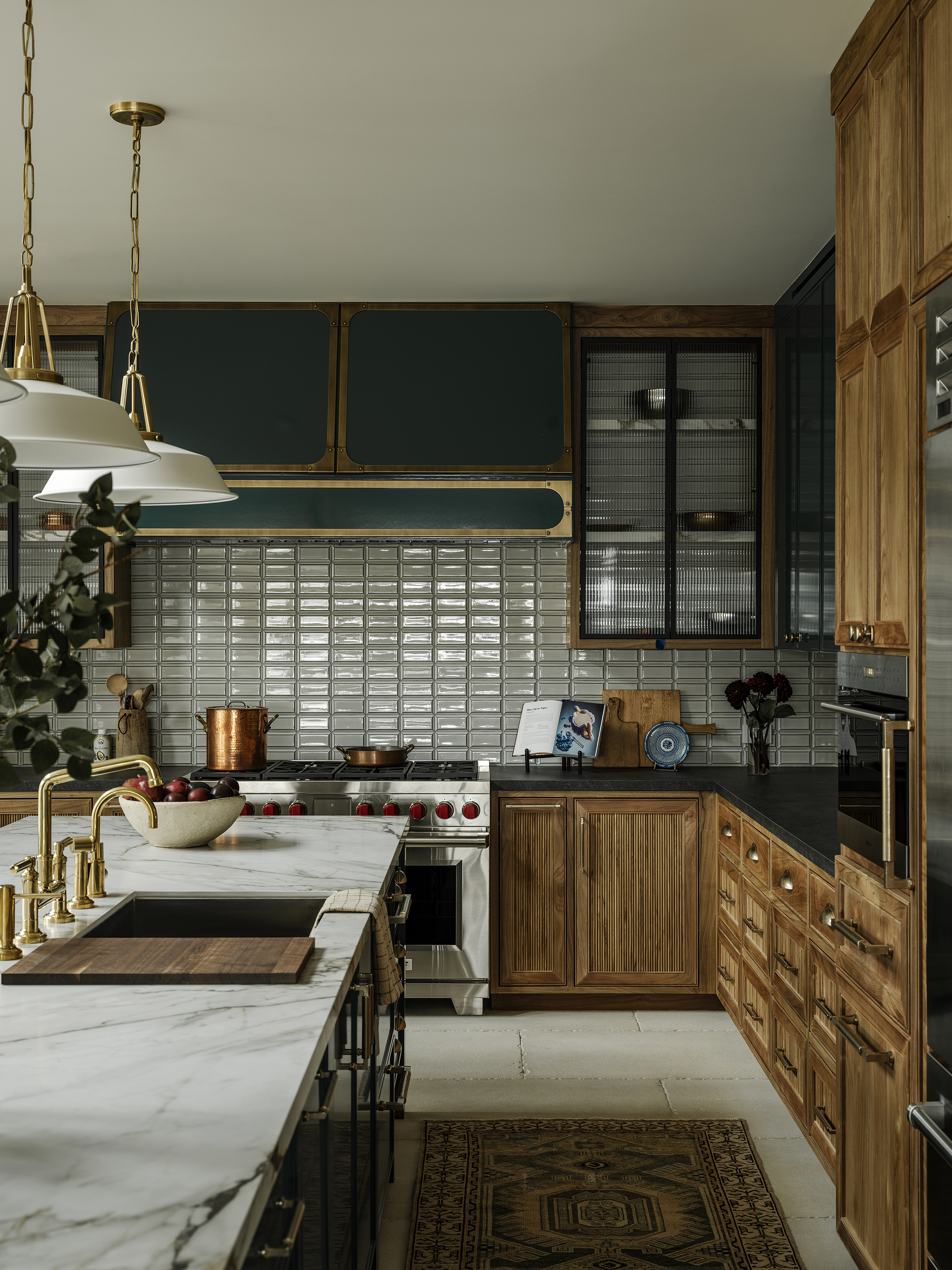
Want to bring the trendy tones into your home? Paint is hands-down the best way to make a huge impact. According to Denise Morrison—an interior designer in California’s Orange County—bathrooms, bedrooms, and dining rooms are great places to experiment with moodier hues because they “create a sense of intimacy and calm while delivering just the right amount of drama.” “Start small by using moody shades in a powder bath or on an accent wall before going big,” she says. “Pair them with warm, adjustable lighting to bring out the richness and depth of the color.”
If you are going to venture off to the dark side, do yourself a favor and think beyond the typical gray or black: Cheung says there are a lot of rich jewel tones like Farrow & Ball’s Stiffkey Blue and Wicked from C2 Paint that feel dramatic, not drab. Meanwhile, Watts recommends embracing analogous tones, which sit next to each other on the color wheel. “They allow for a lot of color without it feeling busy,” she says. “Try a dark deep navy paired with purples and lighter shades of blue.”
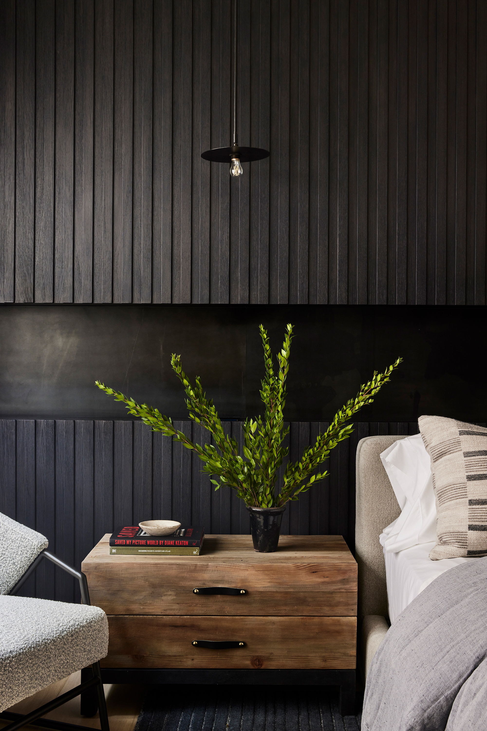
Design by Denise Morrison; Photo by Sam Frost
That said, you shouldn’t limit your go-to moody hue to your walls. “Bring [them] into your home’s palette and add this color through as many materials as possible, not just paint,” says Anand Sheth, who runs his eponymous architecture and design firm in San Francisco. “Think of tile, light fixtures, countertops, wallpapers, concrete sinks, enamel plumbing hardware, and colored glass.”
Moody shades are certainly of the moment, but if this is your first time dealing with deeper tones, it might feel like a major risk. Fortunately, Watts says you can temper the drama with “rich moody furniture, accessories, and art.” “Try a deep jewel-toned sofa or large piece of art,” the designer adds. In fact, eggplant or chocolate brown throw pillows and blankets can be an easy, affordable way to capture the look well within your comfort zone. Best of all? Should the “it” colors change as we creep closer to 2026, these accessories can easily be swapped and make room for a new palette.
We only recommend things we love. If you buy something through our site, we might earn a commission.
