Color Your Garden
Color excites us, but it scares us too. Or at least it does when we read about color theory and attempt to apply it in the garden. Primary, secondary, analogous, and complementary colors; intensity, value, and hue. So much to worry about. Well, forget it.
You got dressed this morning without thinking about these things, didn’t you? And you probably didn’t worry over a color wheel for hours when you decorated your house, either. Most of us approach these tasks intuitively. Whether we’re conscious of it or not, we have an instinctive way of approaching color. Don’t fight it; apply the same technique to your garden.
ONE-COLOR WONDERS
Choose a single hue for a simple design
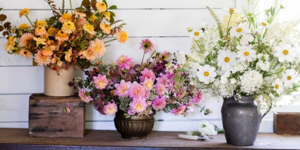
Open your closet. Does one hue predominate? In mine, for instance, there are a dozen shades of red and, except for neutrals, hardly any other colors. Is it a surprise, then, that something similar happened in my garden? There, shades of pink reign supreme—everything from blush to magenta. In the spring, a few blue-flowered bulbs pop up; in summer, a handful of yellow perennials. But they’re the equivalent of a neck scarf or a piece of jewelry. My garden is unquestionably pink.
You can use the same approach with yellow, orange, or blue. Monochromatic schemes are the easiest to design and also the easiest to live with because they’re inherently calming. If things get too serene, you can accessorize—just pop in a little contrasting annual color.
Tips for one-color planting
Choose related hues. Use various shades of the same color, from barely tinted to deeply saturated, for richness. Buttercream, daffodil, lemon, goldenrod, and bronze, for instance.
Turn the color wheel. Feel free to slide in a closely related color—a bit of peach with those yellows mentioned above, or a dash of purple with blues.
Reds can burn you. Avoid mixing warm (yellow-based) and cool (blue-based) reds; they are never harmonious together.
Mix shapes and sizes. To keep mellow from being monotonous, make sure flowers are different in size, scale, and shape. Foliage should be richly varied too.
Lighten up. Tuck in a few white plants or a restrained dose of contrasting color to brighten a monochromatic scheme. Add a sprinkling of cheerful yellow to those cool pinks, for instance, or a splash of blue to oranges.
HARMONIC DUETS
Trust your instincts to combine two colors
Maybe using shades of one color seems too tame. Contrasting a burgundy sofa against a forest green wall or wearing a coral sweater with navy pants is more your style. You’re attracted to dramatic color. Use the same instincts in your garden.
Instead of picking one color, start with two. Almost any two; trust your judgment. Complementary colors provide the most dramatic contrasts: blue and orange, purple and yellow. But most people quickly tire of these powerful combinations, so they opt for pastel tints. Or they move one or both colors a little off-center, which is more unexpected. Envision chartreuse and burgundy, or peach and blue-violet, for example. Add a few splashes of a third color, if you like, to balance the other two.
Tips for pairing colors
Strive for balance. Use the two colors in relatively equal amounts.
Vary intensity. If you like complementary color combinations, then lighten or darken one or both shades if you want to reduce intensity. Try deep blue and peach, for instance, or lavender and gold.
Bridge the color gap. Add a third color to enhance the other two: chartreuse with purple and orange, for example, or pink with yellow and blue.
Don’t forget foliage. Remember that evergreen foliage can be part of your color scheme too; it has the advantage of being there year-round. Plants with burgundy or lime-green leaves are particularly useful.
Get inspired. Note the colors of a favorite patterned fabric, then shop for plants with those colors at the nursery. Or take along paint chips in the fabric’s colors.
COLOR ECHOES
Experiment with multi-colored flowers and foliage
Perhaps your style is more impulsive than either of the two described so far. Rather than being attracted to certain colors, you’re inspired by specific objects. You fall in love with a paisley blouse or a plaid sofa, and you build an outfit or a room around it. You can garden the same way.
Choose a multicolored flower or leaf as your starting point. Then pick up one of those colors in a second plant. Play up the brown center of a purple coneflower by planting a bronze New Zealand flax beside it, for instance, or enhance the golden throat of a red daylily with yellow roses. Then just keep going. Depending on your jumping-off point, you could end up with a bold garden or a mellow one; you just got there a different way.
Tips for color repetition
Pick a focal point. Start with a visually dominant plant of an appropriate height and scale for center stage in your flower bed.
Find the echo. Identify an accent color in the flower of your starter plant; it could be the eye, throat, striping, or even a subtle undertone. Now choose a second flower that echoes this color.
Pair leaves and flowers. Foliage can also be your starting point; variegated foliage is especially inspiring. You could, for instance, start with a bronze flax with apricot margins and pair it with an apricot daylily. Then echo the gold eye of the daylily with, say, coreopsis.
Buffer with green. Separate contrasting color compositions with sweeps of neutral green foliage. The general rule in flower beds is two-thirds greenery, one-third flowers.
Be patient. Composing color echoes is trickier than monochromes or duets, but it can also be the most fun.
