See How This Character-Less, Stucco-Encased Home Exterior Was Transformed into Architecture Eye-Candy
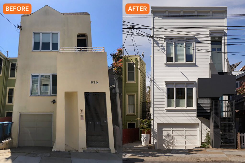
The building had gone through so many renovations its original facade was no longer recognizable.

Gregg Segal
This San Francisco building, which consists of two residential flats, was built in the early 1900s, so it had gone through different renovations throughout the years. But those renovations weren’t necessarily for the better—the exterior no longer had its original facade and architectural style. “The front of the building had been neutered and encased in stucco, obliterating all original detailing and nuance,” says architect Peter Liang, founder and principal at Blue Truck Studio. “The exterior entry stair had been remade as a stucco monolith with a security gate—not quite the kind of character you’d hope for in a 120-year-old building!”

Gregg Segal
In addition to those aesthetic issues, there were some structural problems, too. “The stairs were awkward to use due to some odd geometry,” he says. “It had also settled and cracked over the years, exposing its structure to the elements. There was no space for landscaping.”
Both owners of the flats had approached Peter and his team with the goal of finding an “artful and period-appropriate revision to the front facade and stairs.” They wanted the new design to be durable, more open, and have better lighting, while also preserving privacy and security.

Gregg Segal
While working with the clients to decide on the design, Peter and team also researched period detailing from when the building was first constructed. They also had to go through the process of obtaining permits. “As you can imagine, the process of permitting the project with the city of San Francisco was an interesting conversation with both the Planning Department (the challenge of blending new and old in a city with strong historic preservation) and the Building Department (confirming that a steel ‘tree’ stair could meet egress and structural code),” he explains. “Fortunately these challenges became opportunities to engage the city in an interesting conversation about how the streetscape can evolve and adapt to the times.”

Gregg Segal
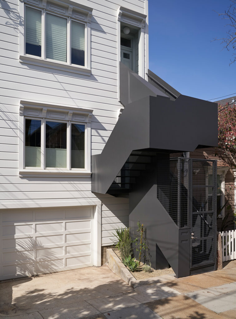
Once everything was approved, they removed the original stairs and stripped the front facade down to its structural core while keeping the door and window openings. The new facade has a new wood skin with Italianate details.
And while the facade has Old World Italianate style, it’s balanced by the more modern structural style of the stairs—an intentional decision that was made by the team and the clients. “The stairs were rebuilt in steel with a central ‘tree trunk’ structural concept,” Peter explains. “A few steel beams cantilever off the central trunk like branches. Solid plate guardrails wrap around the treads and landings, which are made of perforated steel to allow light to filter through.”

Gregg Segal
They developed the exterior’s color palette by studying the works of early American minimalist painters Cy Twombly, Sol LeWitt, and Agnes Martin. “In particular, their soft blue and gray hues and their mastery of texture helped us find paint colors that could work with the simple forms but also give them expression in changing light conditions,” he adds.
The clients are, of course, thrilled with the finished design. “Even though we create documentation and visual representations of our projects to explain it in detail (and in three dimensions), the end result still has an element of surprise and magic,” Peter says. “The clients were pleased with how it turned out even better than they imagined.”
