Retro style with a fresh twist
Designer Jonathan Adler tells all on color as therapy, his obsession with 1970s California design, and how to make vintage work for you
We first became Jonathan Adler fans when his whimsical, creative, not-your-grandmother’s pottery burst on the scene about a decade ago. We remained devoted through his forays into furniture, textiles, and pet products; his interiors for the posh Parker Palm Springs resort; and his ongoing stint as a judge for Bravo’s reality series Top Design. But what really captured our hearts was when we read that Adler’s inspiration for his weekend home on Shelter Island, New York, was none other than 1970s-era Sunset magazine. We asked the exuberant designer to share his creative vision.
Q: Mention ’70s decor, and many people are liable to run for the exits. What are some ways our readers might borrow from the era?
A: When people think ’70s, they think of the Pacer and the oil crisis and national malaise. But to me, the ’70s represent a time of freedom and an amazing time for craft. The 1970s ― particularly in California ― were the height of hippie-dippie rustic modernist design. There’s an amazing book called California Design: The Legacy of West Coast Craft and Style (Chronicle Books, 2005) that profiles the best of the era.
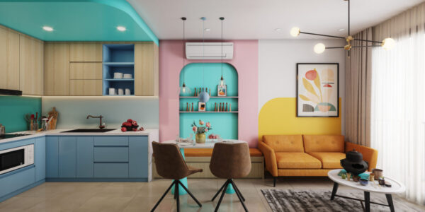
Seventies decor is about wood, stone, pottery, natural fabrics, and a bohemian aesthetic. Wallpaper your bedroom ceiling with grasscloth, drink your morning coffee out of a hand-thrown mug, cover a couch with a suzani (embroidered Asian textile). Most of us have to make a living in a conventional world, but you can fill your home with the earthy and groovy organic forms, textures, and colors of Mother Nature.
Q: In your book, My Prescription for Anti-Depressive Living (Collins Design, 2005; $35), you extol the virtues of using bold color to turn a sour mood into sunshine. How should the average person apply it?
A: I love, love, love color ― it’s the ultimate anti-depressant. How can you feel sad if you’re eating your cereal out of a bright orange bowl? But I don’t believe that color should be used without a plan. I like to choose a very specific palette ― say chocolate, white, and baby blue ― and use those colors liberally. If you show some restraint in a basic scheme, you’re free to dollop in little, tiny punches of color as contrast. I’ve never said no to a splash of lemon yellow.
Q: Is there one great ’70s piece that can be turned into a contemporary statement for the home?
A: The 1970s were the heyday of the hanging chair, and it is most definitely time for a resurgence. Buy one and you’ll never look back!
Q: Can you recommend a few iconic design pieces to search for online or buy as reproductions?
A: I have sworn off eBay after my better half staged an intervention. I was a total eBay addict and spent all my free time searching and buying and collecting ― it was an absolute disaster! When I was an eBay addict, I never would have shared my favorite searches. But now that I’m sober, I’ll happily share my fave search words.
Jonathan Adler’s eBay secret list
Names to spur your own vintage design searches:
Arteluce, C. Jere, Eames, Gibbings, Juhl, Karl Springer, Murano, Parzinger, Paul Evans, Platner, Raymor, Risom, Sputnik, Wegner, Wormley