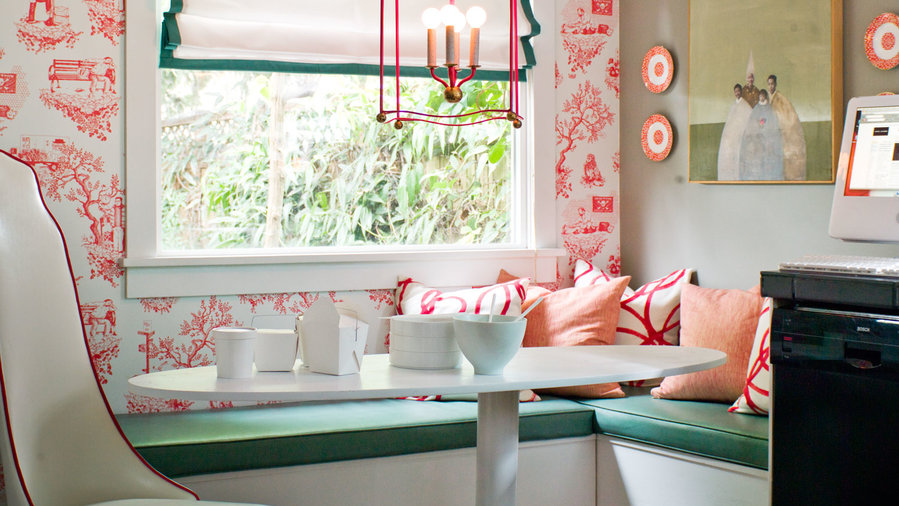
Just add red
The showstopper: One wall of poppy red wallpaper is all it takes to bring life and energy to this dining nook. Red is strong enough that patterns work better than solids. The lantern, pillows, and art pick up on the hue in delicate ways.
The tamer: A complementary wall of greige (a mix of gray and beige resulting in a warm, muddy tone) grounds the red and acts as a neutral without being recessive.
The accent: Cushions in shaded seaglass green are a cool complement to the red and share tonal value with the greige.
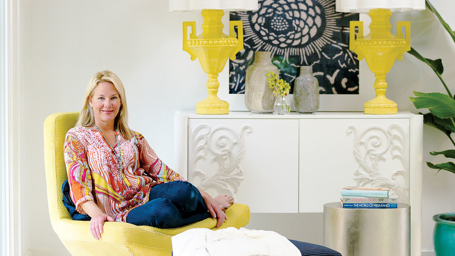

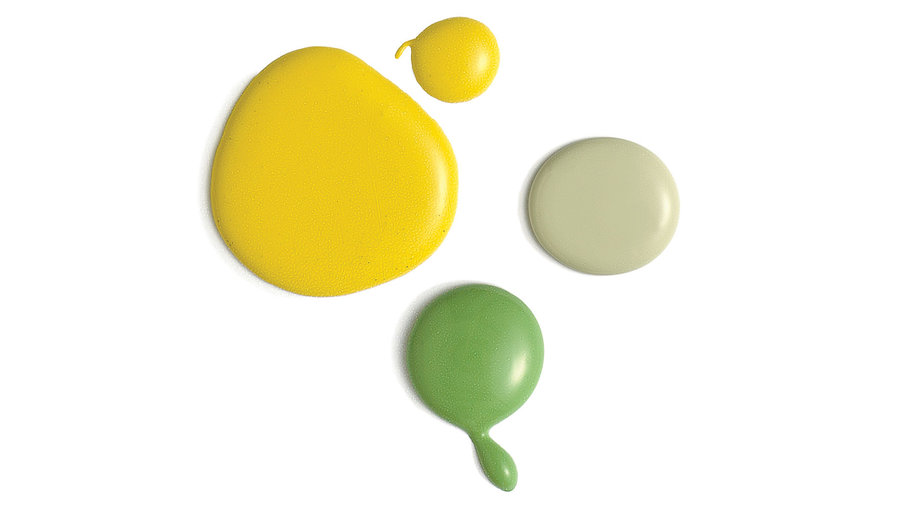
Yellow equals modern
The canvas: A cool white forms the background in this dramatic palette. Paint furniture pieces the same color as the wall to help them fade and make a space look bigger.
The pop: Bright yellow is like a vitamin C shot for a room. It makes plain white look modern and crisp. Use it in at least three places so it doesn’t look random.
The accent: Black makes the yellow-and-white combo sexy.
The glitz: Choose silver rather than gold for a contemporary pairing with warm yellow.
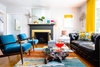
Hot and cold
The canvas: A cool gray—this one has the smallest touch of blue—will look crisp in most lights and let other colors and artwork stand out. Avoid a purple undertone, though.
The mixer: The rug ties the key colors together (and adds kicky orange).
The coordinating pair: Hot yellow and dark teal are complementary colors, meaning they’re guaranteed to work together.
The glitz: Metallics, like the gold leaf on the fireplace, make almost any palette more dynamic.

Strong colors subdued
The canvas: Cool white stands up to the blocks of primary-strength colors.
The coordinating pair: Bright red and saturated green could go “holidays” fast. Keep them separate and sparing to avoid that.
The unifier: Small hits of black temper the bold colors and makes the combo sophisticated.
The surprise: Yellow, in shades varying from squash to lemon, takes this palette out of color-block land.
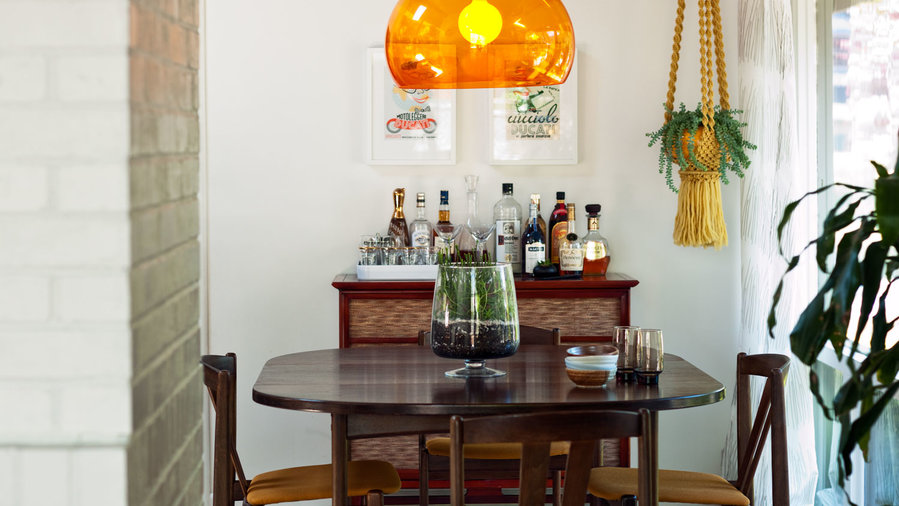
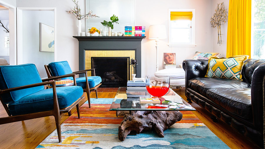
Wake up white and wood
The canvas: White walls and dark-finish wood create a sophisticated contrast that’s slightly warmer than black and white. Consider this pair a universal backdrop—almost any accent colors could layer on top.
The coordinating pair: The shape and gloss of the glass pendant give the orange lamp even more impact—perfect for a room with a minimal color. The blue and white rug adds dimension with both color (it’s complementary to orange) and pattern.
Dressing up dark
The backdrop: Deep charcoal acts as a neutral. Both warm and cool accent tones pair well with it.
The show-stopper: Two shades of gray relate the tile to the wall color. The blues add shock value.
The warming element: Butcher block’s natural tones complement the modern tile.
The wildcards: Small doses of orange and lush green shake up the blue-gray palette.
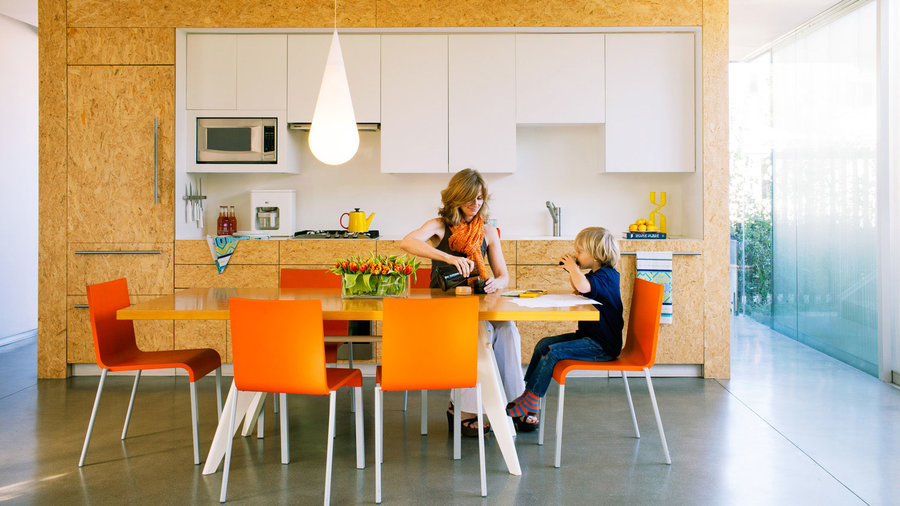

The way to do warm
The natural start: Strand board (also called flakeboard) sets the warm tone here. As the strongest element in the room, it will need balancing.
The counterpoint: Large-scale gray floor tiles are the cool answer to the pressed wood. With the white cabinets, the room has roughly a 50-50 warm/cool mix, which feels serene.
The glitz: Orange chairs take the hue of the wood and turn it up a notch. The intensity makes the palette modern.
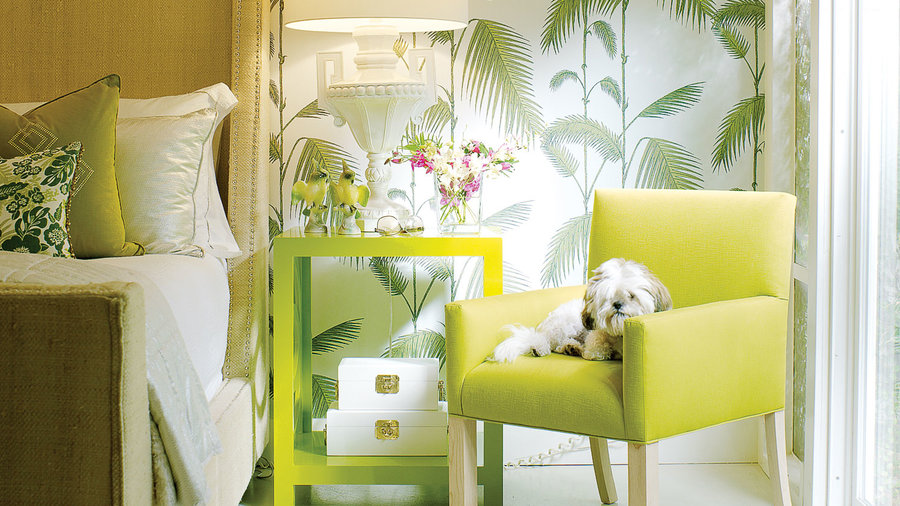

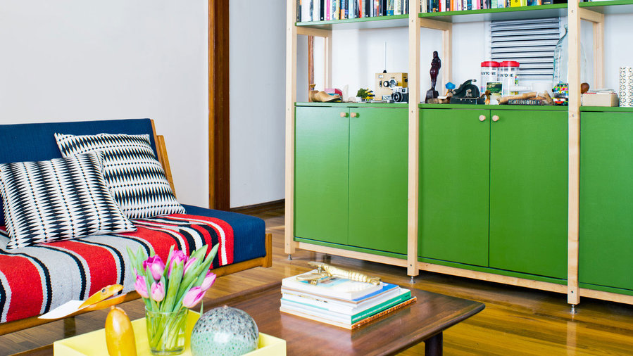
Shades of green
The trio: Three iterations of one color is an easy way to get an interesting palette. Here, fern green wallpaper, a lime nightstand, and chartreuse armchair need only the neutral linen of the bed to feel complete.
The key: Choose shades different enough to not look like a poor attempt at matching. Look for colors that share undertones. In this case, they all share yellow undertones.
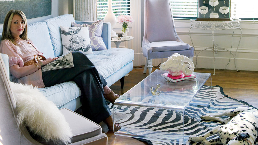

Black and white’s plus-one
The foundation: Black and white—in walls, art, lamps, and the hide rug—is a versatile platform that can pair with most any color. The key is presenting it with different textures, like the shaggy pillow and worn pillar.
The accent: The pale blue sofa brings lightness to the stark beginnings.
The warming element: Linen slipper chairs play against the cool blue to bring a bit of warmth to the room.

A family of colors
The family: Jewel tones look good as a group because they’re all bright colors with a small dose of ebony. They’re made for coordination. Choose one color—blue in this case—to feature more prominently, and do so with two shades, such as the sapphire curtains and turquoise sofa.
The mixer: A pattern containing all the jewel tones in the room, like the fabric on the back of the white sofa, makes the palette more sophisticated.
The hit: Ruby red is an attention drawer, so use it on a small-scale piece of furniture to avoid overwhelming the palette.
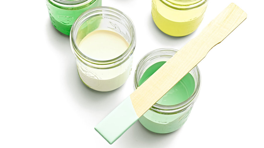

Paint palettes: Tips for getting started
Using colorful palettes extends from decoration to more permanent changes to your home. If you're thinking of dabbling in a bright (yet tasteful!) paint palette, here are some key pointers:
Swatch-test colors before committing. Really. We mean it. Printed pages (even ours) and paint chips can vary from the actual paint color. Happily, you’ll now find many paints in inexpensive sample sizes.
Choose low- or no-VOC paints. In addition to the formulas available from eco-friendly brands, almost all paint makers now offer one or both of those options in all colors.
Use a tinted primer for dark and bright colors. Testing for this article turned us into believers; it greatly improves coverage. Ask the paint retailer for a custom mix compatible with your surfaces and paint.

Blue and gray
A rich peacock blue gets a hip midcentury look thanks to cool slate and pale gray.
Main: Blue Jewel 510B-6 (behr.com for stores)
Trim: Strictly Silver 140-2 (mythicpaint.com)
Accent: Orion Grey TH14 (ralphlaurenhome.com for stores)
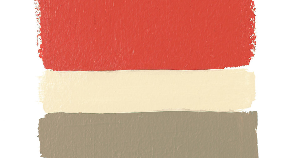
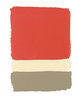
Orange-red and neutral
Orange-kissed red paints are the newest way to show off your wild side. Here’s one inspired by San Francisco’s Golden Gate Bridge. Tone down a lipstick-worthy hue (in a good way) with a cool taupe and a warm off-white.
Main: Claret Rose 2008-20 (benjaminmoore.com for stores)
Trim: Morocco Sand 515-3 (pittsburghpaints.com for stores)
Accent: Nourish .04 (yolocolorhouse.com)
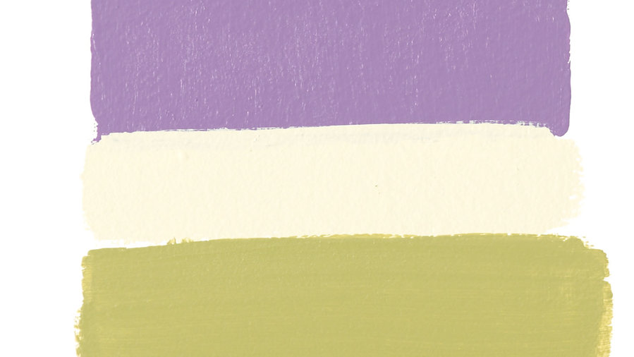
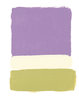
Purple and green
Majestic purples are taking on softer pink tones. Their nature-inspired companions are mossy green and a near-pistachio shade of white.
Main: Orchid Blush GLV05 (glidden.com for stores)
Trim: White Cap 081-1 (mythicpaint.com)
Accent: Sorrel P-H8IE1A1 (greenplanetpaints.com)
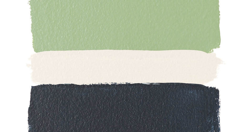
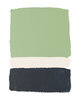
Green and dark blue
This jade color has us dreaming of classic cars and vintage kitchenware. Give it an updated spin with inky blue-black accents and cool white trim.
Main: Cedar Green 2034-40 (benjaminmoore.com for stores)
Trim: True North FA016 (freshairechoice.com)
Accent: Coal Blue E16-1 (dutchboy.com for stores)
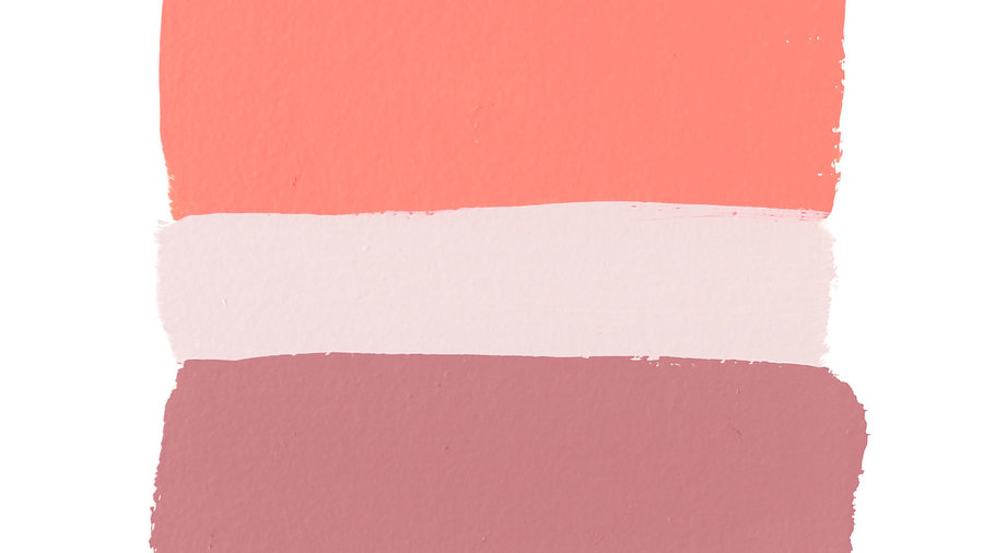
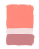
Pinks
Like a sunrise in Taos, this pretty palette is all peaches and misty mauves.
Main: Animated Coral SW 6878 by Sherwin-Williams (sherwin-williams.com for stores)
Trim: February Frost C44-1 (olympic.com for stores)
Accent: Smoky Mauve GLN07 (glidden.com for stores)

Our favorite resource
We checked out several free online paint tools and found Benjamin Moore’s Personal Color Viewer (benjaminmoore.com) the easiest to use.
The site allows you to preview paint colors in its sample rooms (lots of style choices) or in photos of rooms that you’ve uploaded. It’s great for trying out color combinations before paying for paint. (But you’ll still need to swatch-test!)

