
Keep it adaptable
More: See the rest of this inventive home
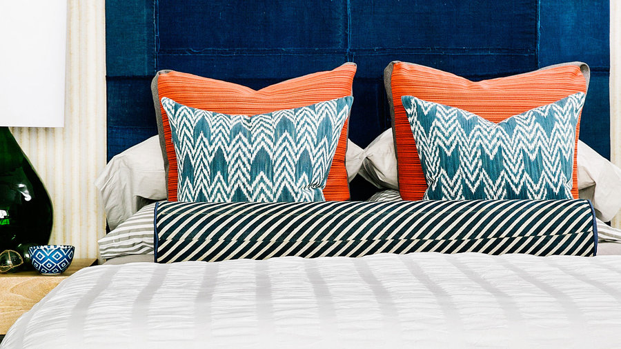
Keeping the backdrop simple—white comforter, neutral sheets—allows for endless reinvention of the rest of your bedding. In this room in Seabrook, Washington, designed by Brian Paquette, a combination of orange-red and blue patterned pillows with a striped bolster gives the bed a bold (yet changeable) identity. Pillows, Grain Design (www.graindesign.com).

Make neutrals cozy
More: See the rest of this dreamy modern cabin
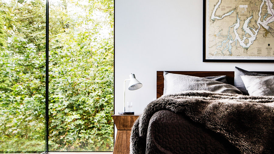
In a Washington cabin, the palette couldn’t be simpler, yet the look is anything but stark. Layering different tones and textures with neutrals is a foolproof way to keep bedding interesting. A deep gray faux fur throw gives the bed its dive-into-it feel.
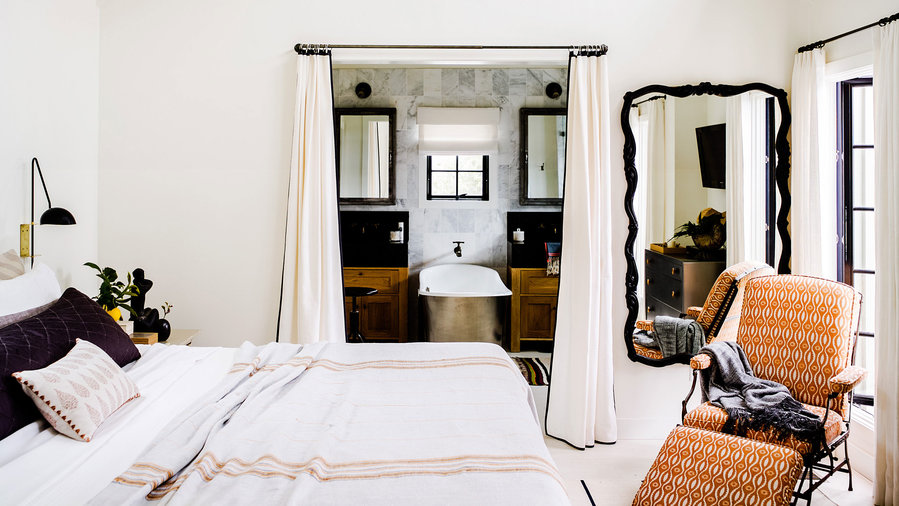
Balance prints with solids

Add a rustic touch
More: See the rest of this beach cottage
Black and white give this Laguna Beach bedroom its drama, but the linen bedspread plays a pivotal role—grounding the look of the space and giving it a subtle earthiness. The orange stripes, which echo the hue of the side chair, tie the palette together. Rustic Linen Blanket in Pewter with Tangerine Mid-Gray, $428 for queen; coyuchi.com.
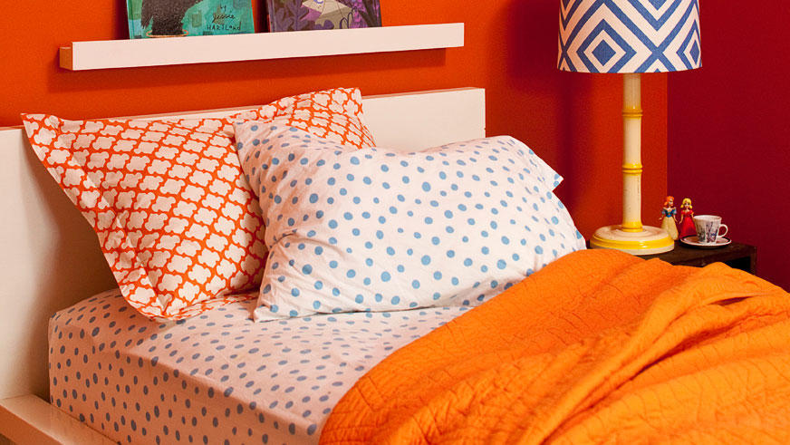
Don’t play by the rules
More: 23 kids' bedroom designs
Cartoon characters aren’t the only option for kids’ bedding. This bedding mismatches freely—combining two equally strong hues and patterns—and the effect is as playful as any train or superhero print.
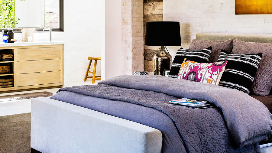

Go tone on tone
More: See the rest of this rustic-modern ranch house
The owners of this home in Corona del Mar love neutrals—and are savvy about using them. In the bedroom, the upholstered headboard and bedding may all be in the gray family, but the subtle variation in textures keeps it from looking flat. A few bold accent pillows go a long way in livening up the space too.
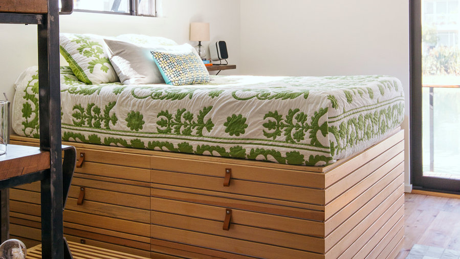

Make it count
More: See the rest of this space-savvy houseboat
In this tiny bedroom (on a floating house!), the bed offered the single opportunity for a style statement. The owners took advantage by choosing graphic green and white bedding, which is softened by the warm wood of the platform bed below and the lightness of the rest of the space.
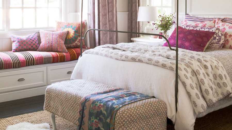
Keep it in the family
More: 9 ways to decorate with patterns
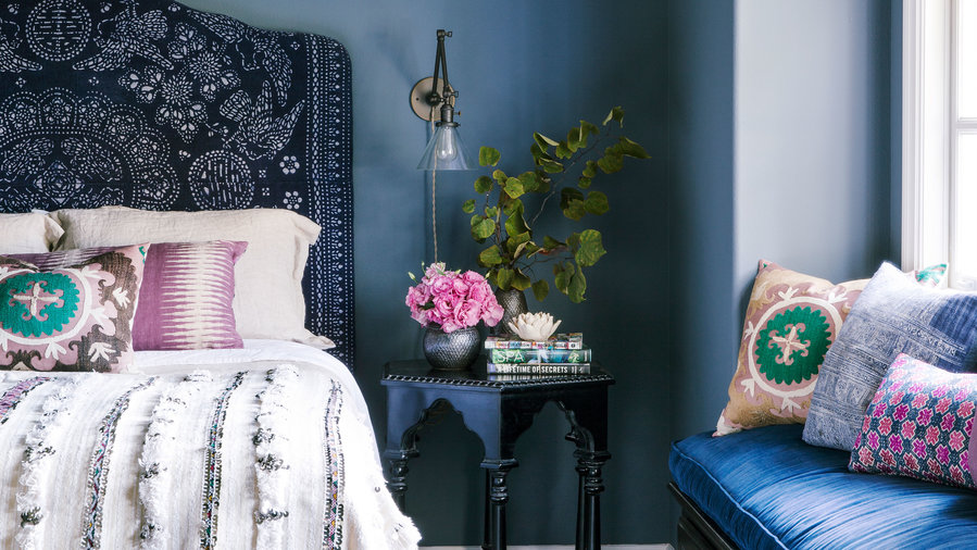
When you keep the tones similar, you can layer a lot more pattern on a bed than you might think. With a simple paisley coverlet as the starting point, the designer went wild with the pillows—but kept within the pink and purple color families. The simplicity of the rest of the room—white walls, jute rug—also keep the room from going into pattern overdrive.
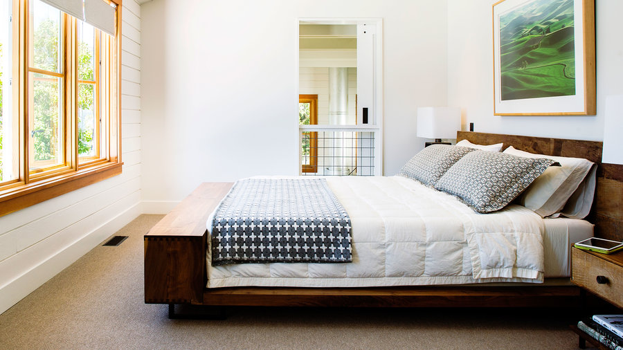

Break up expanses of white
More: See the rest of this lake house
Hotels tend to favor white bedding because it’s naturally calming, but without something to visually break it up, it can look sterile, not to mention unfinished. In this lake house, a simple patterned navy throw and accent pillows are all it takes to anchor the room, while still preserving the vibe of a retreat.

Go Scandi
More: 7 must-haves for Scandinavian style
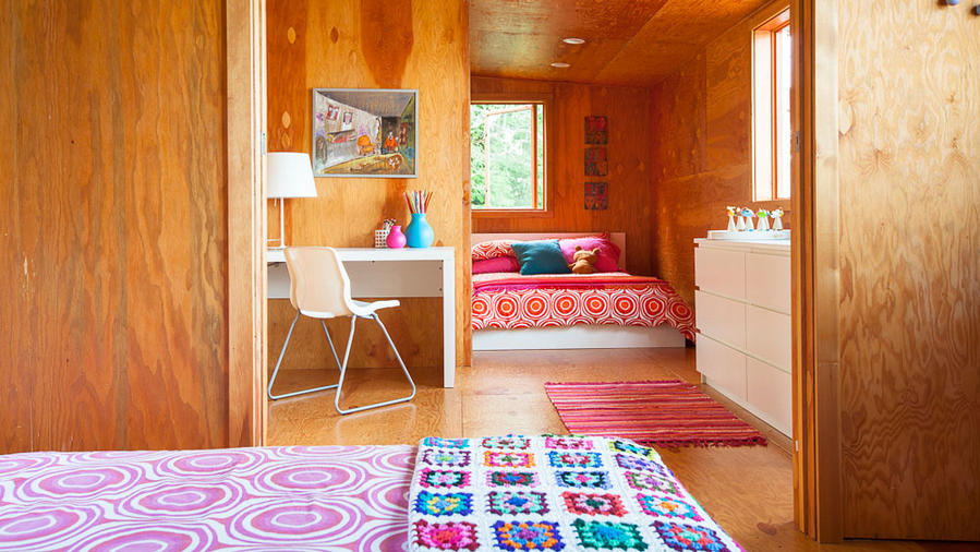
In this cabin, graphic hot-pink Scandinavian bedding looks particularly modern when paired with glossy white furniture against a backdrop of birch ply walls. The rug and vase carry the color scheme into the next room without letting it take over.

